Fashion chain MATCHESFASHION.COM has unveiled a new store design, developed by MRA Architecture&Interior Design designed to bring together the digital and physical platforms of its brand.
The flagship store at 36 High Street, Wimbledon Village, London, showcases the brand’s edit of the best new and established international labels across womenswear and menswear, and serves as a physical touchpoint for its wider online offer.

Established in 1987 as a bricks-and-mortar retailer, MATCHESFASHION.COM has grown into a global omni-channel business with 14 London stores and an international website operating in 195 countries worldwide. MRA was invited to create a modern luxury shopping environment that would bring together the digital and physical platforms of the business.
Tom and Ruth Chapman (joint CEOs, MATCHESFASHION.COM) commented: ‘After 27-years in Wimbledon Village it felt right to bring the four smaller boutiques together into one big, dynamic, interactive space that showcased our online business and presented an edit of the many international and emerging brands we work with.’ MRA interpreted MATCHESFASHION.COM’s ‘edit’ –their flair for finding exciting new designers and selecting the most beautiful pieces– as a form of collage.
Anshu Srivastava, director at MRA, explains, ‘We felt that the way MATCHESFASHION.COM bring their unique selection of fashion into the lives of their customers, could be seen as a series of projections, through social and print media, from the internet to in-store. It’s a communication that we termed “digital to analogue”. These ideas led us to the work of artists such as Donald Judd and Christopher Bruno; we simply love their pure forms and manipulation of space.
We explored sculptural projections in the design of the staircase, mid-floor pieces and the folded perimeter walls.’ Srivastava continues, ‘In minimalist sculptural constructions, materiality becomes all important; the craftsmanship, attention to detail and simple palette of materials that typifies Judd’s work, for example, also became central themes of the new MATCHESFASHION.COM concept.’
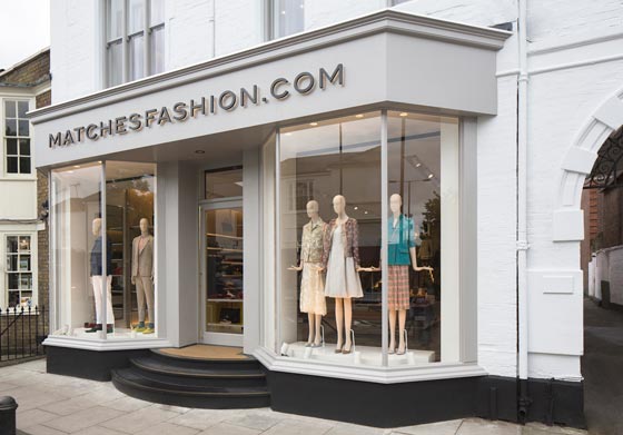
The new store occupies a prominent location in Wimbledon Village, a single 320 sqm space over two floors. Reconfiguring the internal layout allowed MRA to place the customer at the centre of the retail experience. Enlarged windows within the new shopfront improve views into the boutique, giving it a strong street presence; simple and clean store signage echoes the label’s pared down online branding.
The store design has a simple palette of materials, including terrazzo and toned timber veneer, which blend to create a calm sensibility, providing a neutral yet inviting backdrop against which to display a diverse range of apparel.
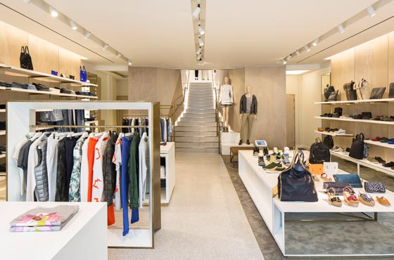
The ground floor focuses on contemporary denim, footwear and accessories. Here, the mid-floor furniture consists of generous and versatile display tables with pop colour elements. Twin hanging rails, one solid and the other in wireframe form, punctuate the spaces between.
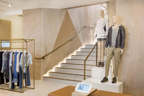
A dynamic terrazzo stone staircase –highlighted with aged brass details and lined with asymmetrically facetted birch veneer– links the lower and upper floors. Natural light floods from the skylight above to draw the customer onward, ensuring that the journey upstairs is open and inviting.

Concealed lighting heightens the drama by emphasising the angles of the toned timber panelling.
This manipulation of the space has resulted in a sophisticated and rich experience. At the top of the staircase, a textured wall with brass highlights creates a striking backdrop for the mannequin podium feature. The stylised mannequins, minimalist in appearance, complement the design.
Above the stair in the 7m long skylight, sculptural hanging screens have been designed with a gentle organic fluidity. These combine with suspended lighting to create a contemporary installation. In contrast to the ground floor, the first floor is fully carpeted to heighten the feeling of comfort and relaxation.
International womenswear and menswear collections are displayed on continuous perimeter rails with a sculptural folded backdrop and Carrera marble plinths. Accessories are presented in finely finished display cases, which are cantilevered from the veneered stair balustrade.
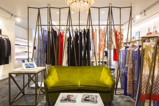
The folded backdrop motif is reprised in wireframe form in the toned brass hanging rails and table legs. The solidity of the marble table tops contrasts with the lightness of their bases. Moving past the staircase, clients enter the lounge area with its original 1960s Gio Ponti furniture and Sciolari chandelier.
Here, they can explore the full MATCHESFASHION.COM edit online with iPads, browsing alone or with a sales consultant. Beyond the lounge area, the wireframe concept is repeated in the full-height brass screen, which incorporates a hanging rail to match the perimeter.
This screen creates an intimate evening wear and fine jewellery area, while still allowing views across the first floor. Digital touchpoints throughout the store are visible, accessible and user friendly. The interfaces have been designed from the out-set to be part of the store aesthetic.

They enhance the brand experience by providing a seamless transition between the physical and online sides of the business.
Client – MATCHESFASHION.COM
Concept Architect – MRA Architecture & Interior Design
Lead Consultant/Project Manager – MRA Architecture & Interior Design
Lighting Design – Paul Nulty Lighting Design
Main Contractor – Esprit UK
Millworker/falegnameria – Clements
Photos courtesy Ed Reeve
by AN shopfitting magazine ©
MRA Architecture and Interior Design
Led by directors Anshu and Stephanie Srivastava, MRA Architecture and Interior Design is a dynamic architectural consultancy specialising in the design of uniquely crafted and captivating retail interiors. Since its formation in 2002, MRA has collaborated with a host of international clients, working on arresting retail interiors that reflect their passion for creativity and desire to engage in interesting and challenging projects. The result is a reputation for the successful delivery of retail environments from concept design to completion. Projects include: Agent Provocateur’s store on Madison Avenue, New York; Juicy Couture’s flagship store in Regent Street, London; the design of House of Hackney’s first store in Shoreditch, London; and most recently the new interior concept for MATCHESFASHION.COM


