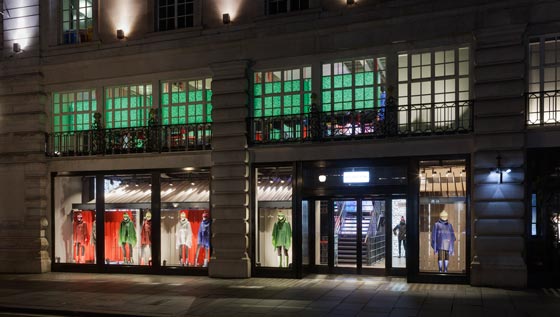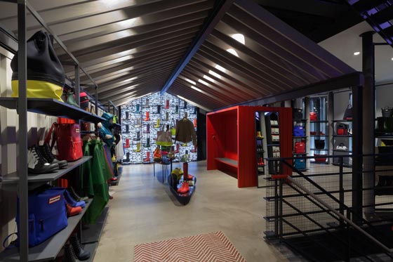
UK brand and retail designers Checkland Kindleysides have designed Hunter’s first global flagship store in collaboration with Hunter’s Creative Director Alasdhair Willis.
The store which is located on Regent Street, London will form the foundation of future retail and shop-in-shop opportunities worldwide.

“The store is a journey designed to capture the senses and a spirit of adventure, it’s a playful and very Hunter take on the outdoors. It’s surreal, graphic and at times dreamlike, it’s a fantasy take on reality executed in a uniquely Hunter way.” says CK Creative Director, Joe Evans.
The innovative design takes iconic references from the British countryside and re-appropriates them for the urban setting. The store creates a new take on rural architecture and the outdoors, redefined in the spirit of Hunter. The store spans three floors; this provides the opportunity to create three distinct experiences for visitors; each one reflecting Hunter’s pioneering spirit as a brand that ‘takes the path that others dare not take’, with this in mind we decided to treat store entrance as the start of a journey.
One of the first references of the British countryside is a contemporary barn structure that carries through from the Regent Street windows to the inside of the store, creating a transition space between the city environment and the ‘outdoors’ and the start of the journey. Featuring Hunter barn doors, in the brand’s iconic red, the doors form the backdrop to the windows, opening up to unveil the inside of the store. ‘Daylight’ filters through the grey tinted Douglas fir rafters of the barn, giving a sense of sunlight after a downpour, with ‘puddle tables’ below displaying products in a playful way, as if they were sitting in standing water.

At the end of the barn, a gabion dry stone wall displays the brand’s iconic Original Wellington boots, first introduced in 1956. Beyond the barn is ‘the courtyard’, which has a forest of hand-painted Douglas fir trees; these are designed to be almost ghost like as silhouettes.
Between the trees product is merchandised, and beyond this area are a series of glazed apertures with vistas into an ‘infinity forest’. This is an illusion which is created to give a true sense of a magical world beyond the store boundary. Providing a dramatic backdrop to the staircase is a 5m high LED screen running between the ground and first floors.
The screen entices customers upstairs and presents exclusive content from the brand’s London Fashion Week shows to campaigns, film and recent events. These screens will give Hunter the opportunity to deliver real-time broadcasts from events around the world.
Referencing Hunter’s unquestionable relationship with the infamous British weather, the screen will display regular weather updates from throughout the UK; each time accompanied by a coordinating soundscape that echoes throughout the store.

The journey building vernacular, in grey mesh with treads of rubber; giving a brand relevant underfoot experience. The first floor is designed to bring out some of the British eccentricity of the brand and is a surreal take on an enclosed English garden, where the collection is displayed against a backdrop of topiary hedges, which pop as illuminated pieces of art; whilst the hand-made green ceramic floor tiles hint at an archetypal well-kept lawn.
The feeling in this space is light and airy. Again, it is imagined the rain has passed and more ‘puddle tables’ sit in the enclosed garden displaying products, some of which are hung over the ‘puddles’ as if they are drying. Set behind a wall adjacent to the hedges are spacious fitting rooms, they are an adaptation of the boot rooms downstairs, with slatted walls and doors individually painted in Hunter colours of green and red.
The contemporary concrete cash desk includes a red seal featuring Hunter’s original identity of a pair of scales with the date of the company’s founding, 1856. The seal is also used as a discreet detail in key areas around the store. Behind the cash desk, a pair of barn doors painted with soft rubber touch paint, provide a sensory experience similar to touching Hunter footwear. The doors are slightly ajar and an illuminated image creates a sense of a hidden vista beyond.

Positioned in key locations on the ground and first floors, there are seating areas to reference a rural ‘boot room’; each features headphones for customers to listen to curated soundtracks that evoke experiences associated with product within the space. On the first floor the boot room in the vernacular of a farm building is constructed from galvanised steel and provides a haven to try on Field footwear.Passengers taking the lift experience a ‘Field’ soundscape and grass lined walls. Stepping out of lift and into the basement, the feel of the space is distinctly different from both the ground and first floors of the store.
The retail space is a contrast of Hunter red and white, with red element designed to feel as if the basement was part dipped in rubber. This provides a space for playful kids’ product presentation, with pigeonhole displays and red bricks sitting in frames to display products. Kids have their own version of a boot room and there is a recessed space under the pavement lights, which acts as a stage to showcase campaign and product stories. The basement also provides a stock room for the store without losing retail space, as Hunter boxes are stacked like a dry stone wall, creating their own VM display of popular sizes to ease self-selection.

design Checkland Kindleysides
area 492 sqm
Founded in 1979, we are one of the largest design consultancies within the UK. Our offer spans a broad range of design disciplines including graphic communication, identity, retail, interior and digital design. We work with national and international brands across a diverse range of market sectors. Clients include: ASDA, Beats by Dr Dre, Barclays, Belstaff, Bentley Motors, Converse, Diageo, Fitness First, Joseph Cheaney, Nike, Levi’s, Sony PlayStation, New Look, Nixon, Pizza Hut, The National Lottery, The British Library, Timberland, Uniqlo, Virgin Atlantic and Wrangler.


