CuldeSac Custom materializes the offline jump of Freshly Cosmetics with a space that releases the DNA of the brand.
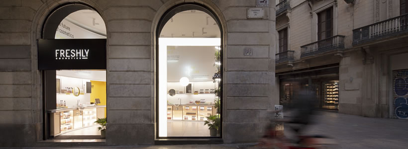
Natural cosmetics startup Freshly Cosmetics opens its first physical store in Portaferrissa 34, one of the main streets in Barcelona and the fifth busiest in Europe. In this important change for the firm, they have relied on the creative team of CuldeSac Custom to design a retail space that offers a real-time experience.
Turning an angled corner into a curve means smoothing sharp edges; making things easier having a friendly personality. But it also means opening unexplored paths, being pioneers and risky, accelerating routes.

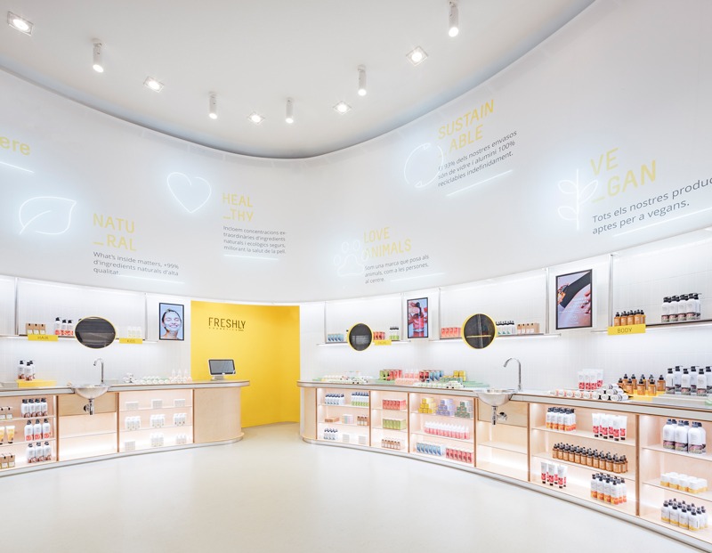
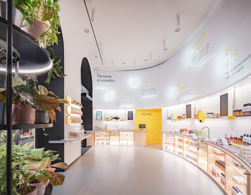
A brave, cornerless firm, natural and transparent, close, but daring. And this is how the first Freshly Store was born. A corner store that, through a curved plane that crosses the space, suggests its route and simplifies shopping for users as a self-service.
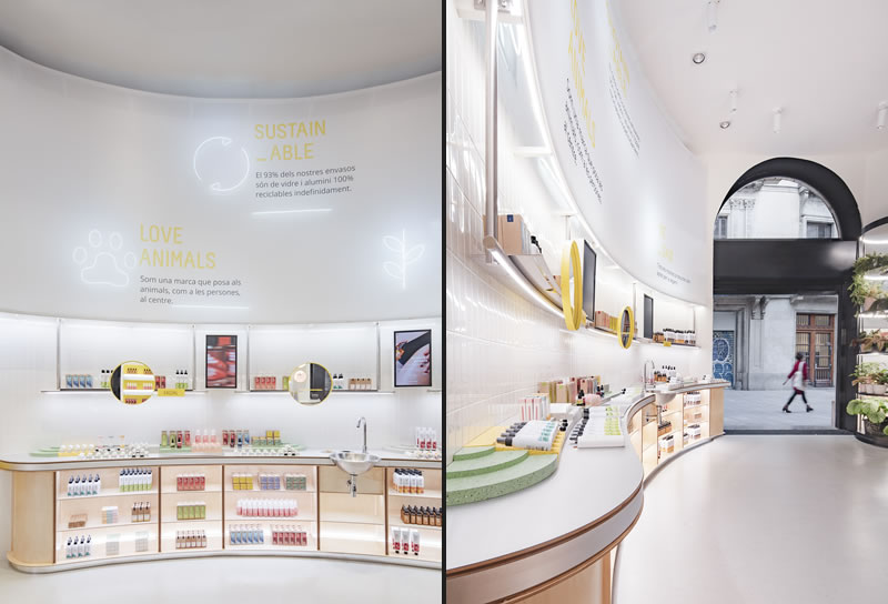
Its façade aims to be invisible, permeable to the eye and to the passageway, so that the interior of the shop impacts the passageway like a large printed canvas and neon lamp. These neons brings the values of the brand to the final user: Natural, Vegan, Love Animal, Healthy, Sustainable.
The entrance is dressed by different plants that evoke the botanical component of Freshly and the origin of its products; they do not appear in the space in a solely decorative way, but are a recognisable element.

The curve of the store speaks of the route; a self-service store with a way in and out; a shortcut in the street. The shape of the shop invites the consumer to enter, guides him through the space and shows him the exit route once it has been covered in its entirety.
By means of technology, the Freshly Store offers an innovative shopping experience
The store has a static point of payment and, in addition, two other mobile points where you can pay directly with card or from the mobile, without queues or waiting times. This is a very intuitive space, from which the user learns as he discovers it in his own way.
The materials chosen for the store represent Freshly’s identity; on the one hand, they speak of their natural and close component through the use of recycled flooring with natural fibers, wood and tiles and, on the other, they contrast with the more technical character of the brand through a canvas, stretched with neons, tubes and stainless-steel shelves.

The Freshly Store is the extension of brand values and DNA: it is fresh, vibrant and innovative; it has the strength to guide the future of cosmetics.
by AN shopfitting magazine no.155 ©

