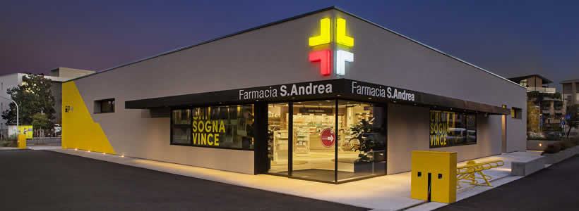
In collaboration with the Municipality of Vicenza, a renovated former petrol station has become the home of a pharmacy established in the 1970s and present in the same neighbourhood ever since. The pharmacy is tightly integrated into the surrounding cycle paths and transit areas.

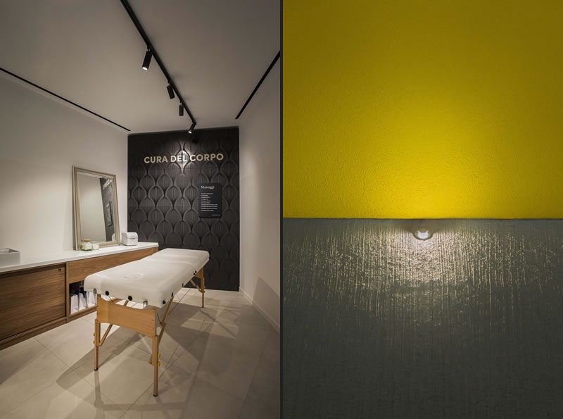
A venerable establishment offering innovative services, the Sant’Andrea pharmacy has revolutionised the concept of a pharmacy. This is not only a shop that sells medicines, and herbal and homoeopathic preparations, but also offers personalised services, with areas set aside for trying out body and skin-care products; health, sport, diet and wellness options, and free maternity advice sessions.
PHARMACY DESIGN
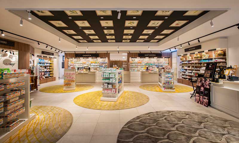
This objective of providing an integrated experience, tailored to the customers’ needs, completely transformed the design, and spurred the architect, Paolo Omodei Salé of Omodei Studio, to turn the aseptic and notoriously cold world of pharmacology into a warm and welcoming environment.
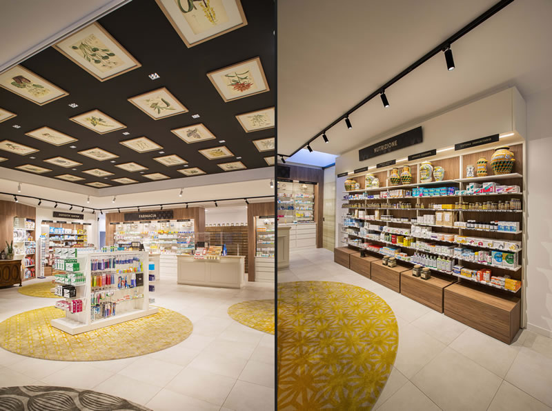
He did this both by using natural materials such as wood and some of the antique furnishings present in the previous premises, such as furniture and albarelli (the old medicinal jars designed to hold apothecaries’ ointments and dry ingredients), and by doing away with pillars to create a large, open, airy square without a predefined, constrictive pathway that would set rigid boundaries between the professionals and the customers. Instead, customers are guided by signage whose carefully designed graphics recall the motifs on the albarelli.

On the ceiling, above the display gondolas, an enormous coffered ceiling was created, which has become the pharmacy’s distinguishing feature. Its composition of paintings and prints depicting medicinal plants is the work of Caterina Romio from the No.parking design agency.
LIGHTING
Light from carefully positioned L&L Luce&Light fixtures enhances the design both inside and out. Bitpop 2.2 recessed fixtures with a high colour rendering index are installed between the ceiling panels. Invisible, thanks to their deep-set optics and flush installation, they provide unparalleled visual comfort.
The same type of lighting was also required above the counters, where pharmacists and customers interact. Here, it is supplied by Bitpop 2.2 and Bitpop 1.0 fixtures. Black and white Stinger spotlights, also installed in the ceiling, illuminate the display gondolas and the products on the walls.

Outside, colour (yellow and grey) has been used not only to make the pharmacy stand out but also to communicate the pharmacy’s fresh, innovative approach – a new centre for citizens’ health services.
Functional lighting on the external walkways is provided by Pasito 1.2 step lights and Bright 1.A recessed fixtures along the wall and on the steps. Smoothy downlights are installed along he underside of the black canopy: Smoothy 2.4 with elliptical optics light the path, while Smoothy 5.4 with rotationally symmetrical optics illuminate the corner entrance. Neva 1.0 linear profiles mounted on brackets are installed along the perimeter wall at the back of the shop, transforming it into a luminous and significant secondary facade for customers entering from the busy street in front.
Location Vicenza, Italy
Project Arch. Paolo Omodei Salé
Photos courtesy Tommy Ilai


