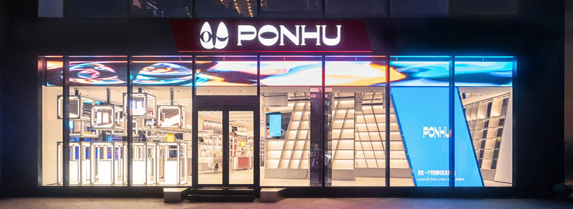
UNFOLDESIGN designed luxury store in Beijing’s fashion centre.
PONHU Luxury Lifestyle Store situated at the iconic fashion center of Beijing, Sanlitun, is devoted to transitioning PONHU’s online professional platform of identifying, collecting, maintaining and selling second-hand luxury goods into an offline brick and mortar retail center.
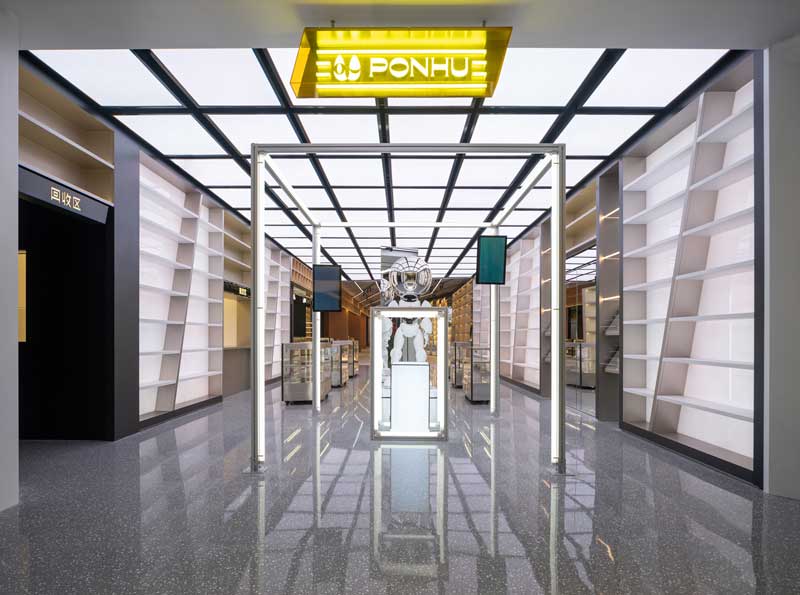
UNFOLDESIGN was commissioned to design and build its first offline flagship store in Beijing. Within 4 months, the UNFOLDESIGN team designed and built a one of a kind retail store that interprets the brand idea through a fully functional layout via in-depth circulation programming, achieving product display exceeding +7,500 SKU requirement, utilization of modern retail technology, and implementation of interactive art installations with subversive visual themes that connect with PONHU’s clientele.
UNFOLDESIGN re-defined the ‘second-hand retail shop’ into a ‘transit station’ with modern interpretations of shopper’s trending ‘attitudes’. In doing so, the traditional luxury retail design and service models had to be deconstructed and reconstructed based on the following focal points: ‘collectibility’ – retaining the value of goods through transparency in service and design; ‘cultural significance’ – the creation of themed zones that reduce the psychological of ‘barrier to purchase’; and enhancement of ‘single item value’ – product display methodology to downplay the cost of goods while encouraging sells.
In order to supplement these design elements, the store is also packed with technological retail tracking systems that make the second-hand luxury goods exchange process standardized, digital and transparent.
The concept of a luxury good
The concept of a luxury good ‘transit station’ implies a facility that is primarily used for the purpose of loading, unloading, or accommodating the movement of passengers (at the store, the passengers are the second-had goods, such as bags, watches, jewelry and art) from one mode of transportation to another (transportation being the customers). The design team supported the setting in which the second-hand goods are soldthrough the juxtaposition of spatial features that exudes the transformation of emotions within city lifestyle, culture and art.
As a result, UNFOLDESIGN created rendezvous points through time and space that enhance the patron’s senses in the form of shopping, resting, observing and interacting.
From the onset of design, UNFOLDESIGN conducted a well-rounded study of customercirculation, particularly the positioning of street-side entrances and their relationship with public traffic flow. Entrances 1, 2 and 3 exert the advantages of street-front entrances, and are taken advantage of through the utilization of modern technology via ‘mechanical window display + multi-media art screens’. Entrance 4 is situated indoors and connected to the mall’s shopping corridor, a passage for convenience, interconnecting the street to the rest of the shopping center.
5 themed spaces
The 1200 sqm indoor space includes 5 themed spaces: ‘Civil Culture’, ‘Precision Manufacturing’, ‘Entertainment’, ‘Spiritual Fortress’ and ‘Glimpse of the Future’. Each area corresponds to different design devices and sculptural features, with social attributes for intrapersonal connectivity, which creates a dramatic but lineal storyline that enhances the shoppers’ experience.
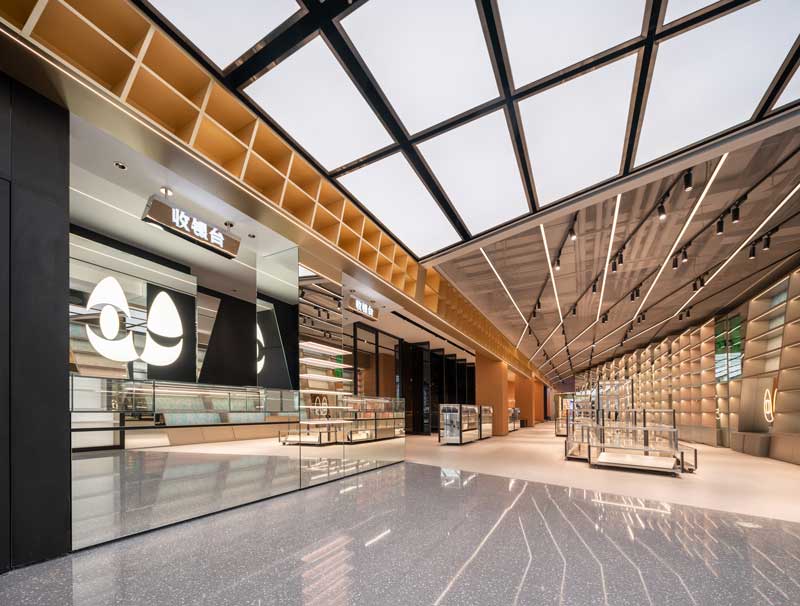
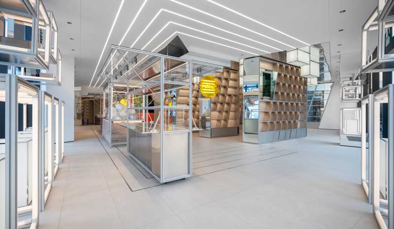
At the main entrance, the intimacy and bustling street market culture are abstractly evolved from the ‘Civil Culture’ themed space. Dense shelving is purposely designed to reflect the crisscrossing streets with monumental ‘buildings’ of product display. There is a customized doll catching claw machine and mobile display fixtures that reflect hawker stalls in city alleys; assembled through the use of extruded aluminum, stainless steel, and geometric lightboxes. In addition, the space is accented with a rainbow display wall to simulate the vitality of a night market. The methodology used by UNFOLDESIGN to display products in this area is intentionally implemented to break down the barrier between customers and luxury products, giving the customers opportunities to unconsciously draw closer to the products. The label of ‘luxury’is downplayed in the area, but it encourages patrons’ desire to play and bargain hunt in the most traditional sense of a marketplace.
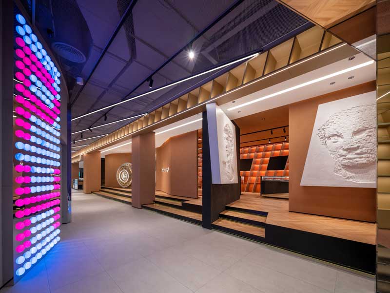
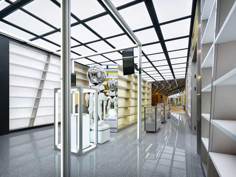
Traditionally, luxury goods are produced through a combination of skilled and precision workmanship. ‘Precision Manufacturing’ themed areaconveys the pursuit of perfection by using brushed stainless steel shelving, revolving conveyor belt mechanical installation, and color adjustable lighting features. The design team selected a customized perforated aluminum panel as the backdrop to the feature wall with dark stucco walls and geometric ceiling, and rough terrazzo replica floor tiles to create a monochromatic environment with strong visual impact. Through the movement of mechanical features surrounded by monumental stainless steel elements, the technological vibe of precision manufacturing is expressed through touch, sound and sight.
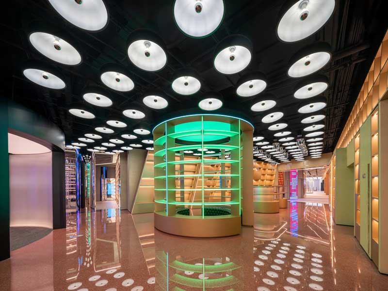
In the adjacent area, the emergence of a turbine-shaped display booth and dynamic ceiling device form an island in the hub, which becomes the gathering place for indoor circulation. Collectible toys and dynamic floating bags depict the entertainment experience of a metropolis under the backdrop of color-changing light features and shadow.
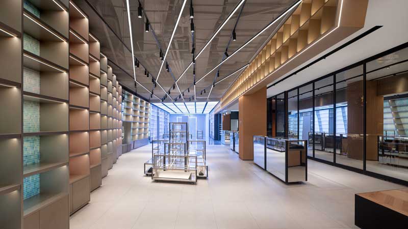
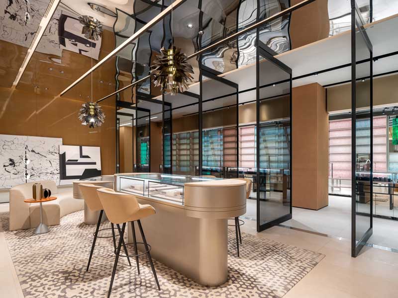
The magnificent scenes described above are all along the street side which attracts people’s attention, but as you funnel towards the back of the space, it becomes catered towards a virtuoso’s exploration. There are a series of spaces with limited edition products, jewelry and watches, along with VIP salon, certification and recycling booths. These areas are inspired by the themes of ‘Spiritual Fortres’ and ‘Glimpse of the Future’ and designed to create an undisturbed and immersive experience through rammed earth colors, silver texture, vault door, pixellated art wall, fiberglass robot and other elements.
All the themes in the space were developed to ensure the penetration of a new PONHU brand story allowing for better emotional connectivity with its customers. The design itself, along with the process, was supported by a series of rational planning by UNFOLDESIGN to ensure a precise portrayal of the new offline PONHU brand: cost and time control, area-effectiveness planning, customer circulation, distance and time consideration between entrances, storage and security system, proper dynamic lighting control and respective color temperature usage based on desired product display quality, and background music selection to support theme captivation.
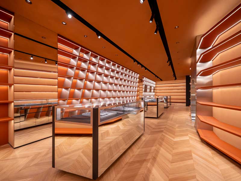
For example, the design team takes advantage of the height of space and irregularly shaped shelving system to achieve the display of massive SKU quantity and distinguish product by category, status and price. Thediagonal shelving units were designed to provide visual directional purposes which unconsciously guide the customer towards preplanned directions.
In addition, to ensure the cohesiveness of an online-offline operation model, UNFOLDESIGN had to ensure the store itself is not only aesthetically pleasing but also data-driven. Modern retail technologies have been used throughout the store such as hot spot circulation sensors, online remote management, and customer counting has been taken to the next level as passerby customers (prior to the entrant to the store) can also be quantified. Post-occupancy goals have also been established to ensure periodic adjustments to future product staging are to be based on analytical data. Such feedbacks are also supported through online marketing channels because the store is used for live streaming sale after normal mall operation hours. This store currently increased its sales duration to 20 hours a day, and almost doubled its revenue per area via its connectivity between online and offline.
The design intent of this project is not limited to just the physical space. UNFOLDESIGN hopes to take advantage of modern technology and the advantages of social media to redefine customer value by exploring the relationship between people and objects, and communication mediums between time, space, and emotions. These ideas may turn a traditional brick and mortar retail store into a ‘transit station’ that reaches far beyond the idea of purely selling goods but to help retailers explore new retail omnichannel potentials to respond to the challenges and opportunities of the future retail market place.
Location: Beijing
Design Studio: Unfoldesign
Design Team: Joseph Chieng, Queena Qiao, Dereck Zhang, Yang Li, Chris Yao
Project Area: 1200 sqm
Photo: Zhanying Studio


